+170%
Mobile Adoption
Drove a surge in mobile engagement after engineering a fully responsive, mobile-first platform architecture to replace a legacy non-responsive experience.

+170%
Drove a surge in mobile engagement after engineering a fully responsive, mobile-first platform architecture to replace a legacy non-responsive experience.
25%
A new dynamic quoting flow delivered the highest volume of unique terms quoted in a single quarter, accelerating year-over-year deal velocity.
92%
Post-launch research confirmed the redesigned interface materially simplified how users assess and evaluate commercial financing opportunities.
UX strategy, product management, research, and design
The StackSource CEO and CTO wanted to modernize and enhance our product, but were unsure of the right approach. After my hire, my top priority was to lead UX strategy and execute the redesign of our core product.
I planned and executed a moderated study that combined user interviews and a task-based preference test. I wanted to understand the day-to-day challenges and needs of each of our external audiences, as well as establish baseline data to support design decisions.
One surprising finding was discovering a pattern of feedback on the prominence of the StackSource brand identity in the platform. I learned through industry research that status and reputation are important in the commercial real estate industry, which supported this feedback.
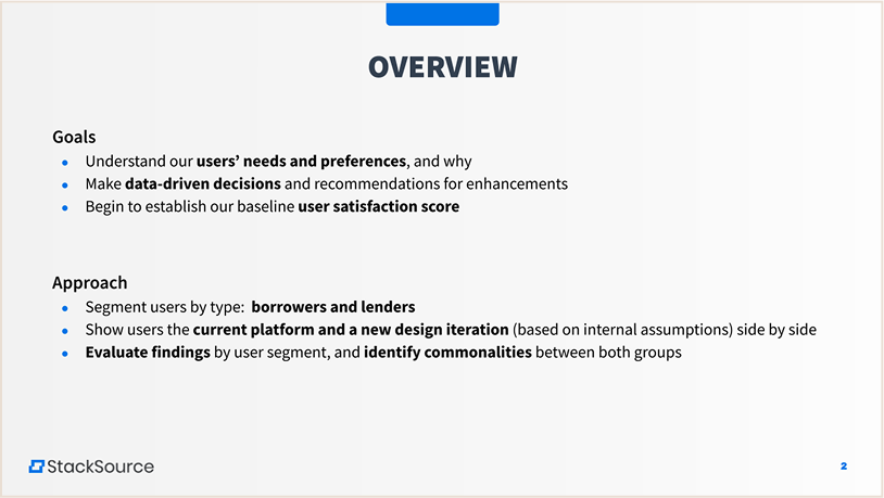
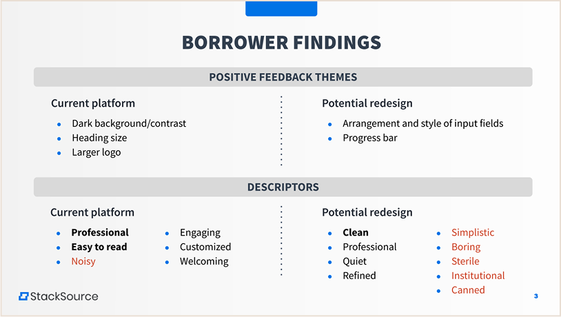
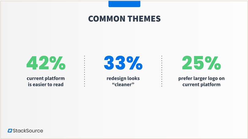
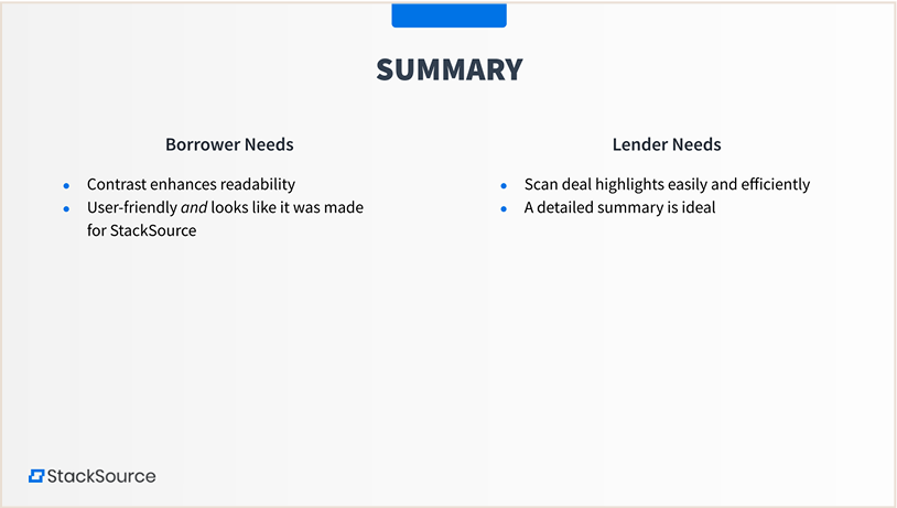
Presentation of findings for executive leadership
Using our study findings combined with knowledge and insights from our internal subject matter experts, we created a set of lean personas for our core user base and target segments.
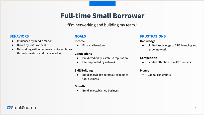
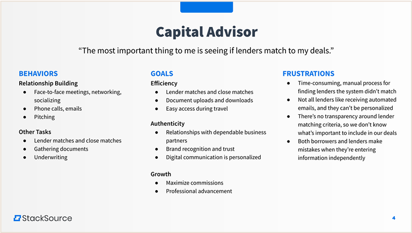
A sample of the lean personas we created at StackSource
We also mapped user journeys to further consider how email and capital advisor touch points were shaping the overarching user experience. This led to enhancement and refinement of our email touch points, which are a key component of using the StackSource product.
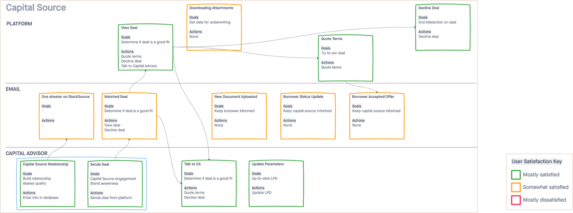
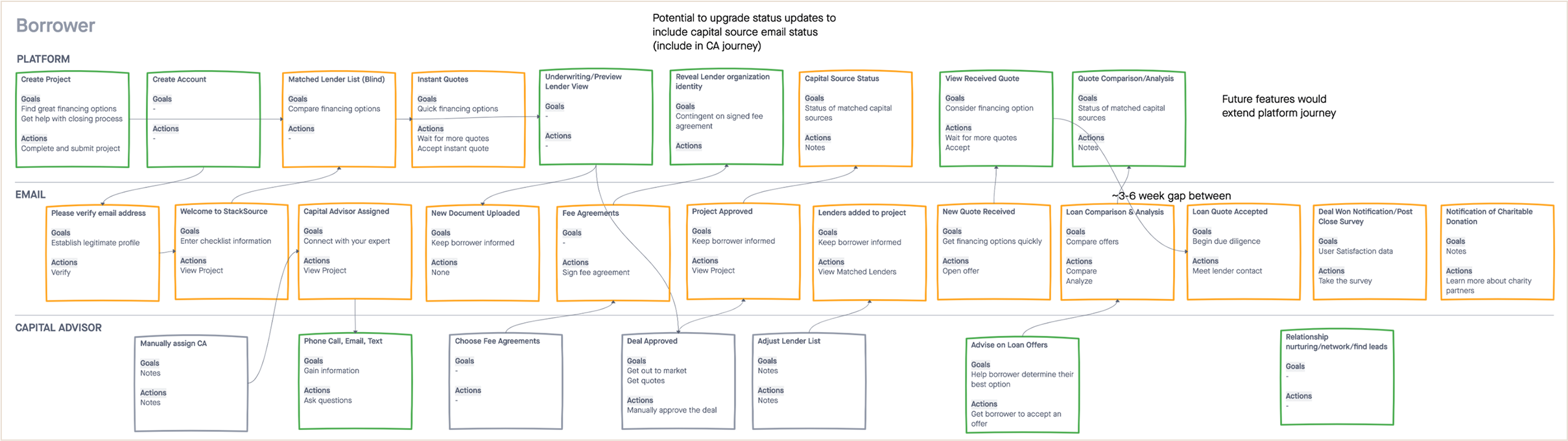
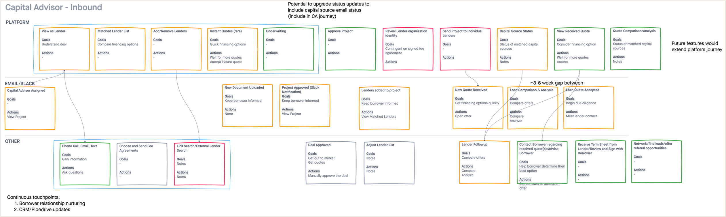
I created user journeys for each primary audience
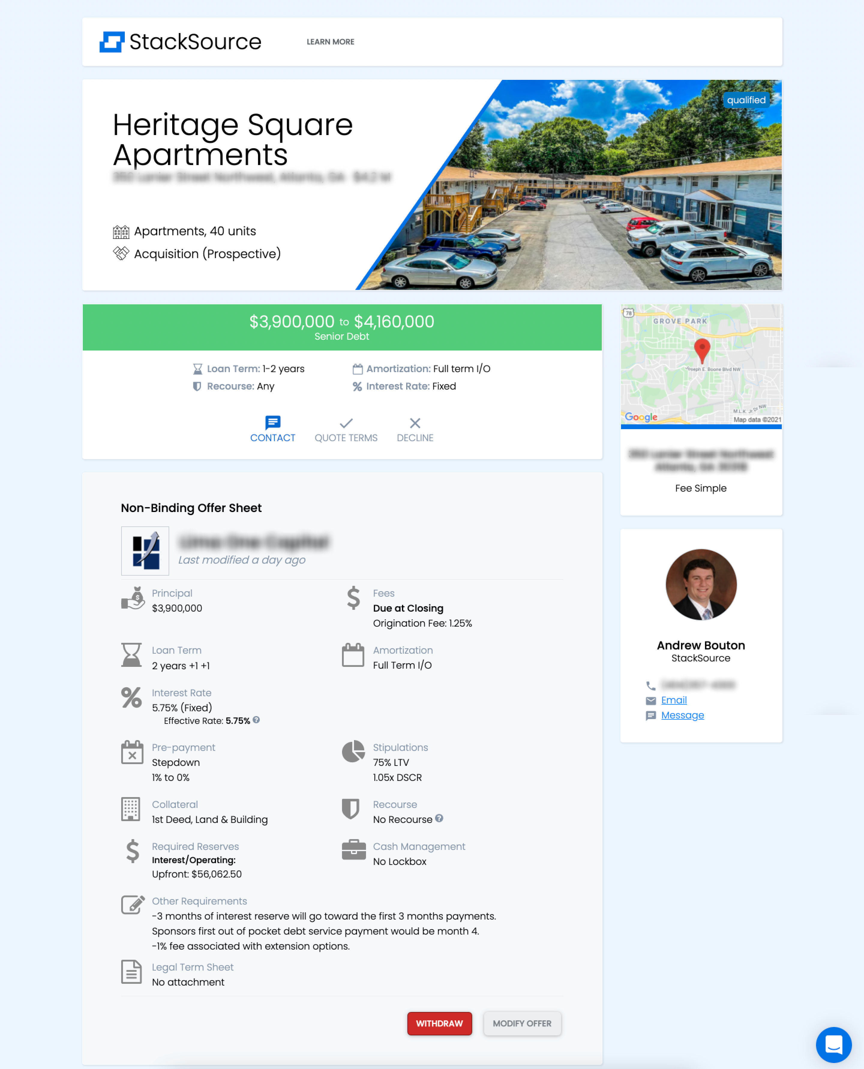
I solicited feedback from our users throughout the design iteration process. I took accessibility compliance into consideration, which the previous design was lacking. Most importantly, I discovered that our mobile use was steadily increasing from our analytics data, and designed the new platform to be fully responsive. (The previous platform was not.)
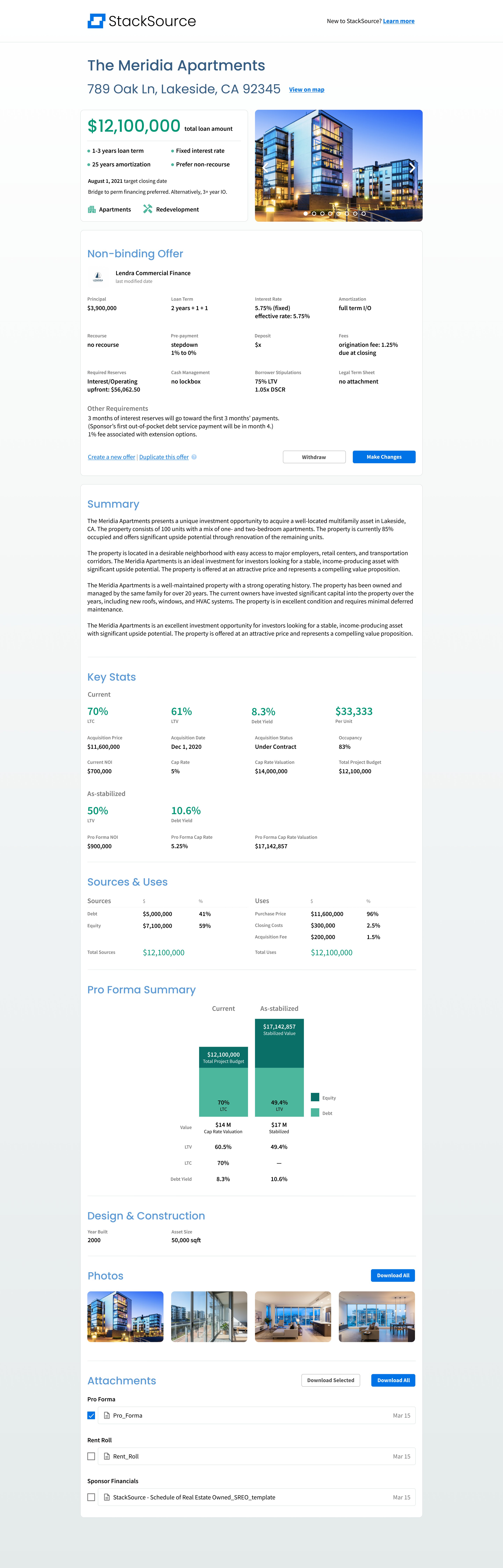

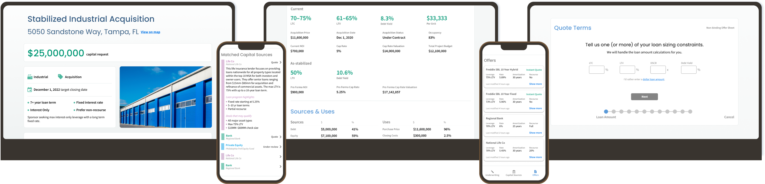
Desktop and mobile screens from my platform redesign
The transformation from our legacy platform to the new design addressed critical usability and accessibility issues. The previous platform lacked mobile responsiveness, had poor information hierarchy, and featured color choices that did not meet accessibility standards for contrast.
Our new design introduced a mobile-first approach, simplified the user flow, and created a more intuitive interface with proper color contrast ratios and accessibility compliance.