5/5
SUPR-Q Score
Achieved a perfect usability and satisfaction score from beta clients after six weeks of intensive platform testing.

5/5
Achieved a perfect usability and satisfaction score from beta clients after six weeks of intensive platform testing.
$65K
Engineered a modern native solution to completely replace legacy software, eliminating recurring enterprise licensing overhead.
100%
Replaced a manual spreadsheet stop-gap with dynamic data architectures that unlock daily access to performance coaching and training insights.
Senior UX Designer collaborating with UX research and engineering teams
Our legacy software solution for reporting on point of sale products is currently unusable. A support team created a stop-gap manual process with spreadsheets and pivot tables, but our clients really want a dynamic solution they can easily access.
After meeting with our business subject matter expert to understand the current stop-gap manual process, I designed a low-fi prototype and iterated through through a few feedback rounds, first.
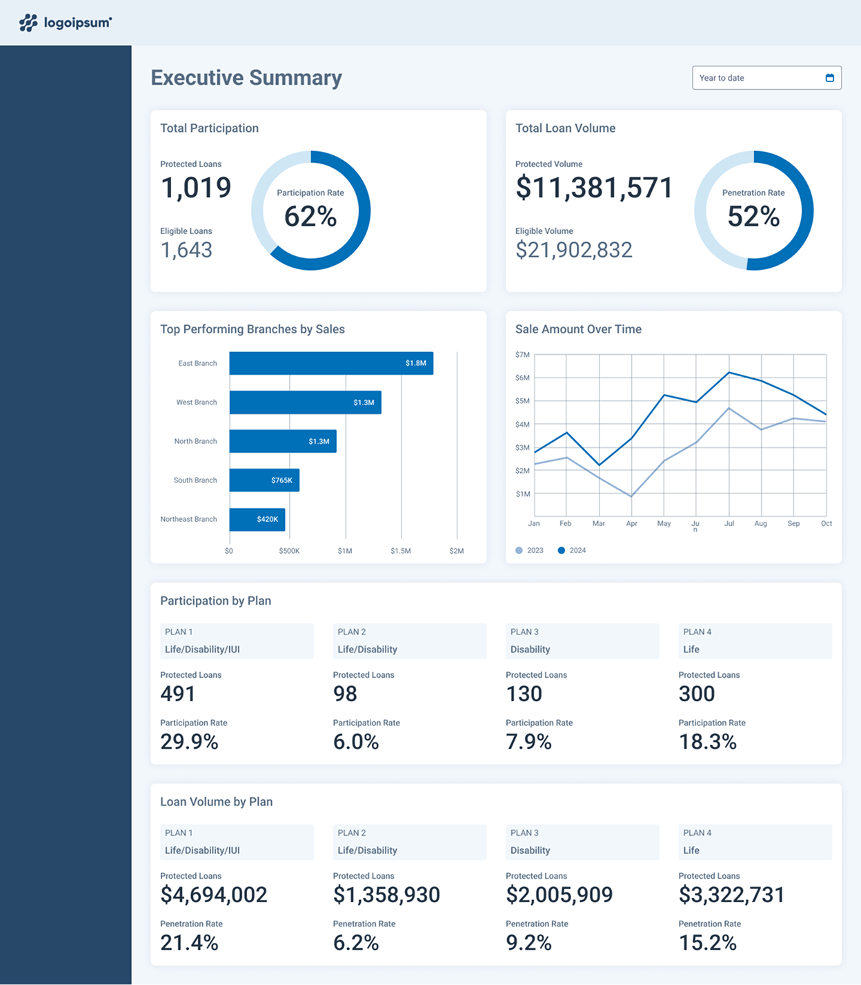
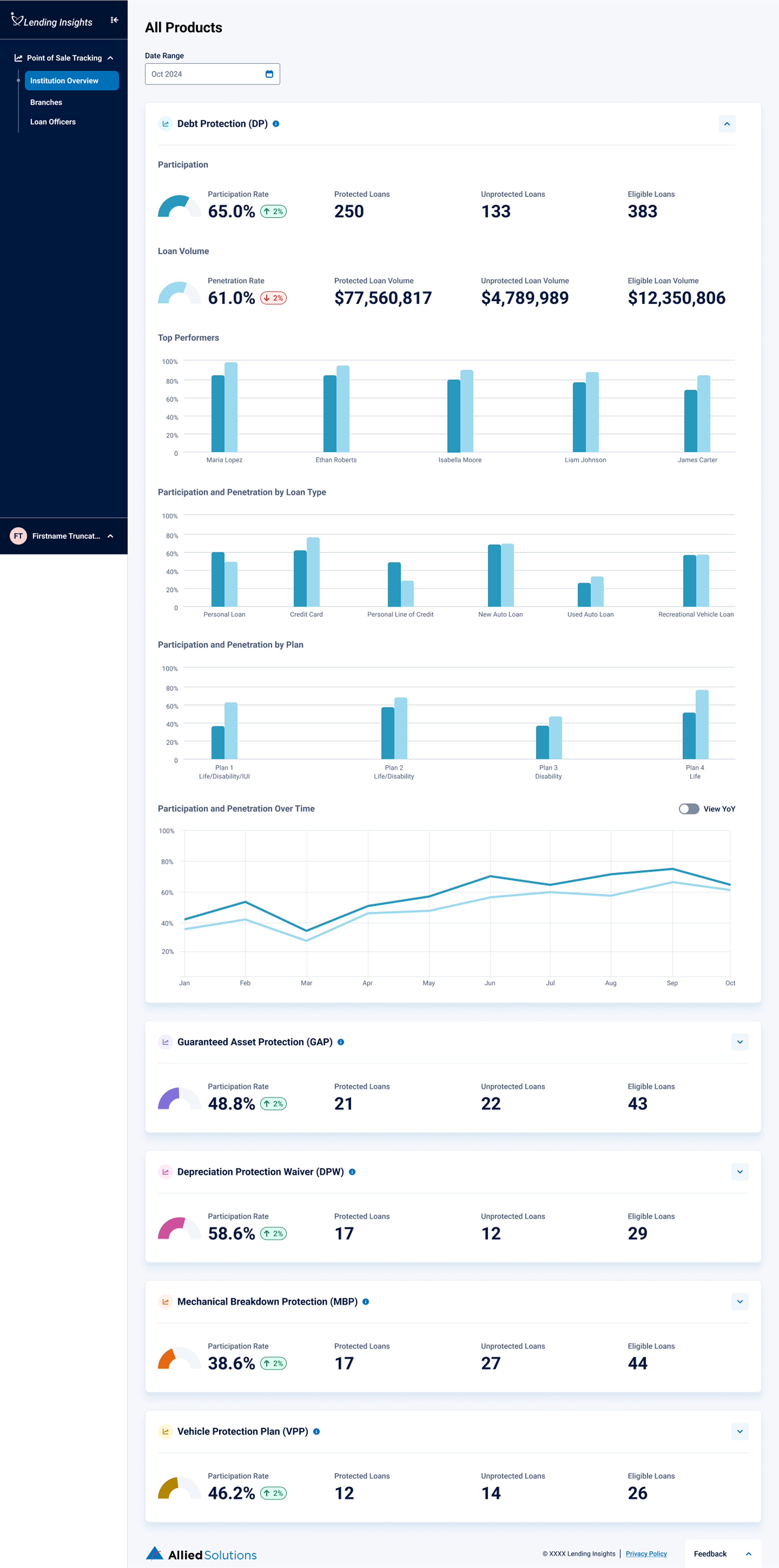
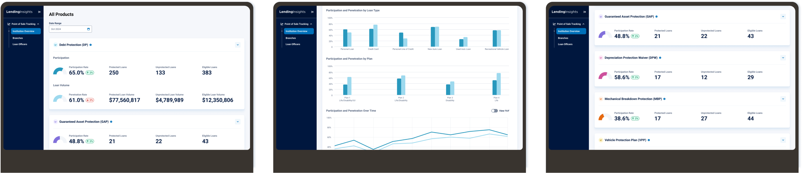
Screens from my first low-fi prototype, and after a few rounds of iteration with our business SME
After validating the final lo-fi prototype with members of our sales team, I designed the first hi-fi version using our design system. We took the first version of the hi-fi prototype to client interviews.
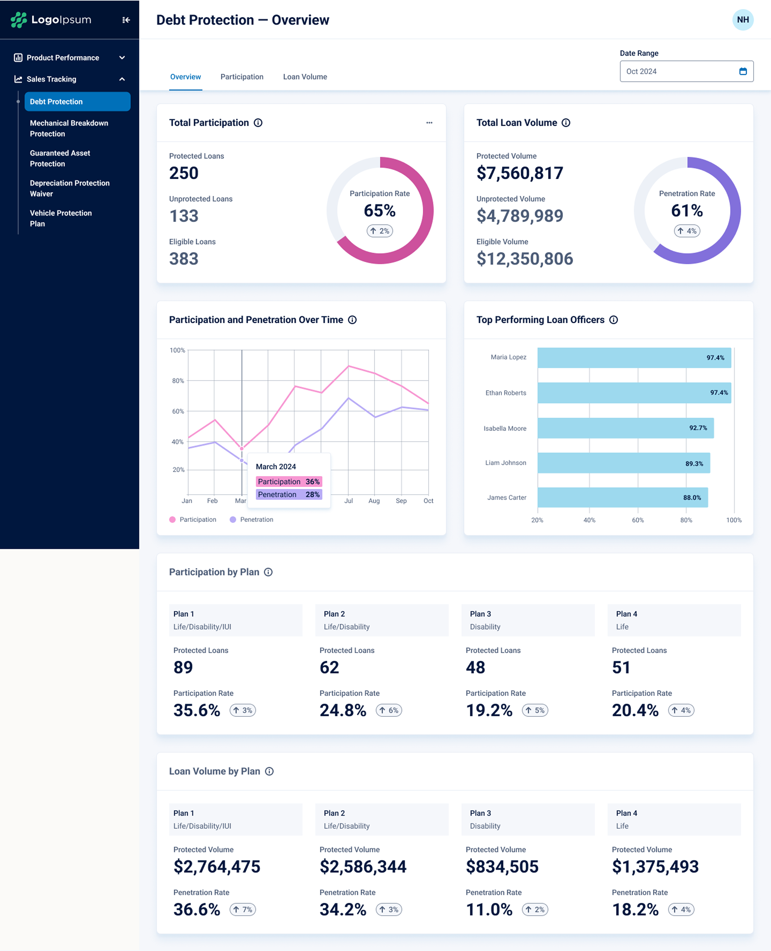
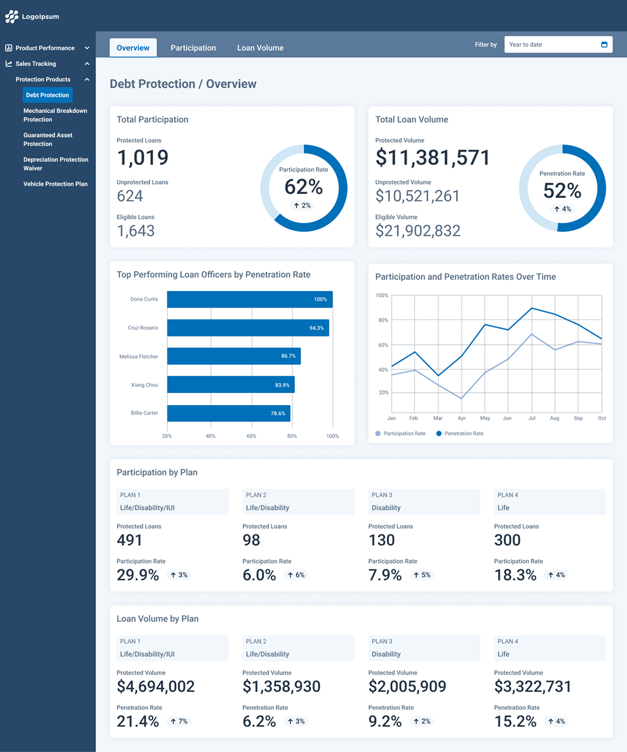
From our clients, we learned that their primary use case with this reporting was to coach their employees on how to boost sales in lagging areas. The screen below shows how individual loan officer metrics were only accessible by one product at a time. Clients wanted to see a loan officer's performance across all products at the same time.
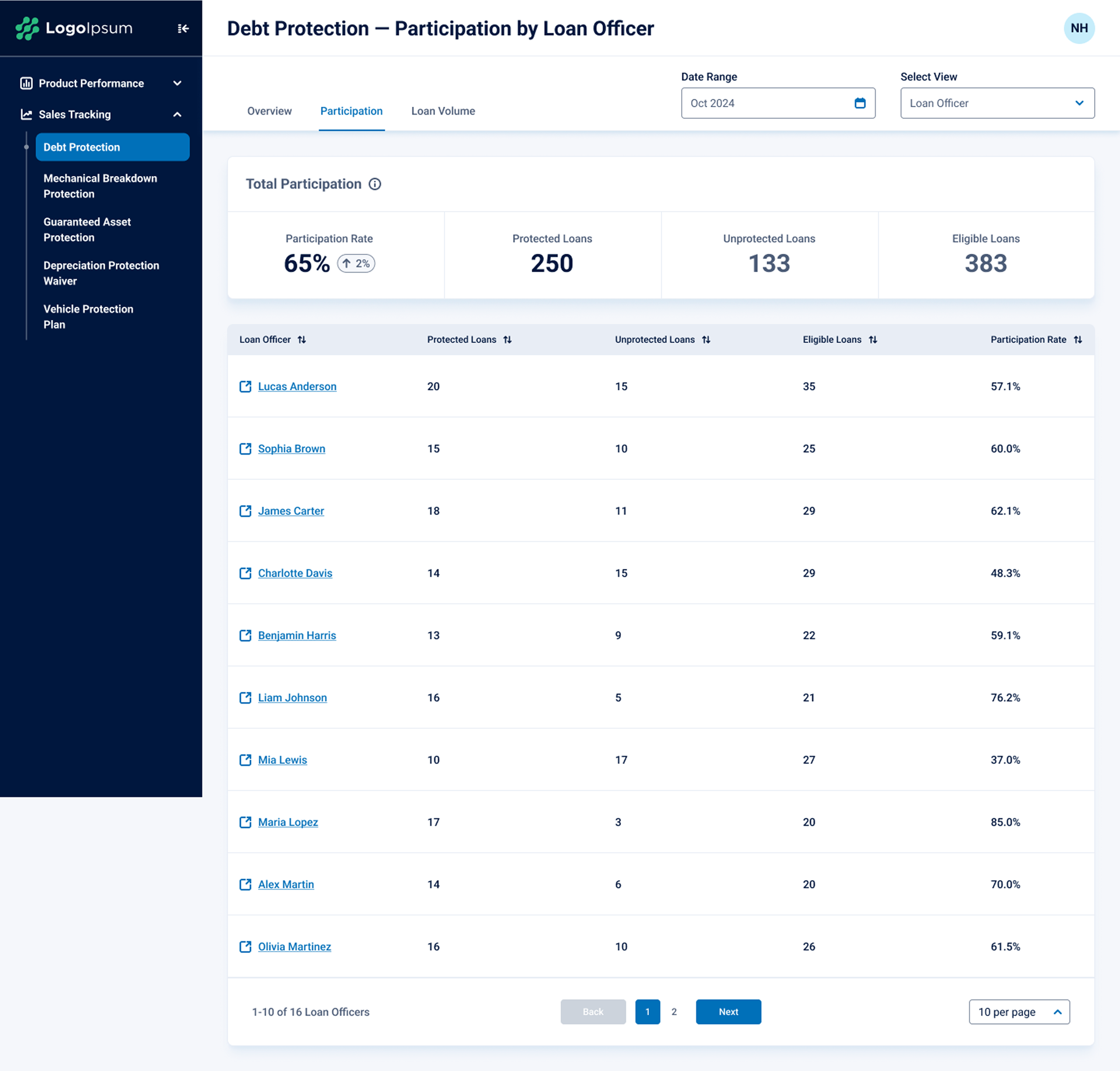
I iterated rapidly so that our researcher would be able to show v2 to clients with whom we had already scheduled interviews. Our access to clients was limited, so we needed to make the most of our sessions. The new information architecture structures the content by levels in the organization instead of by financial product.
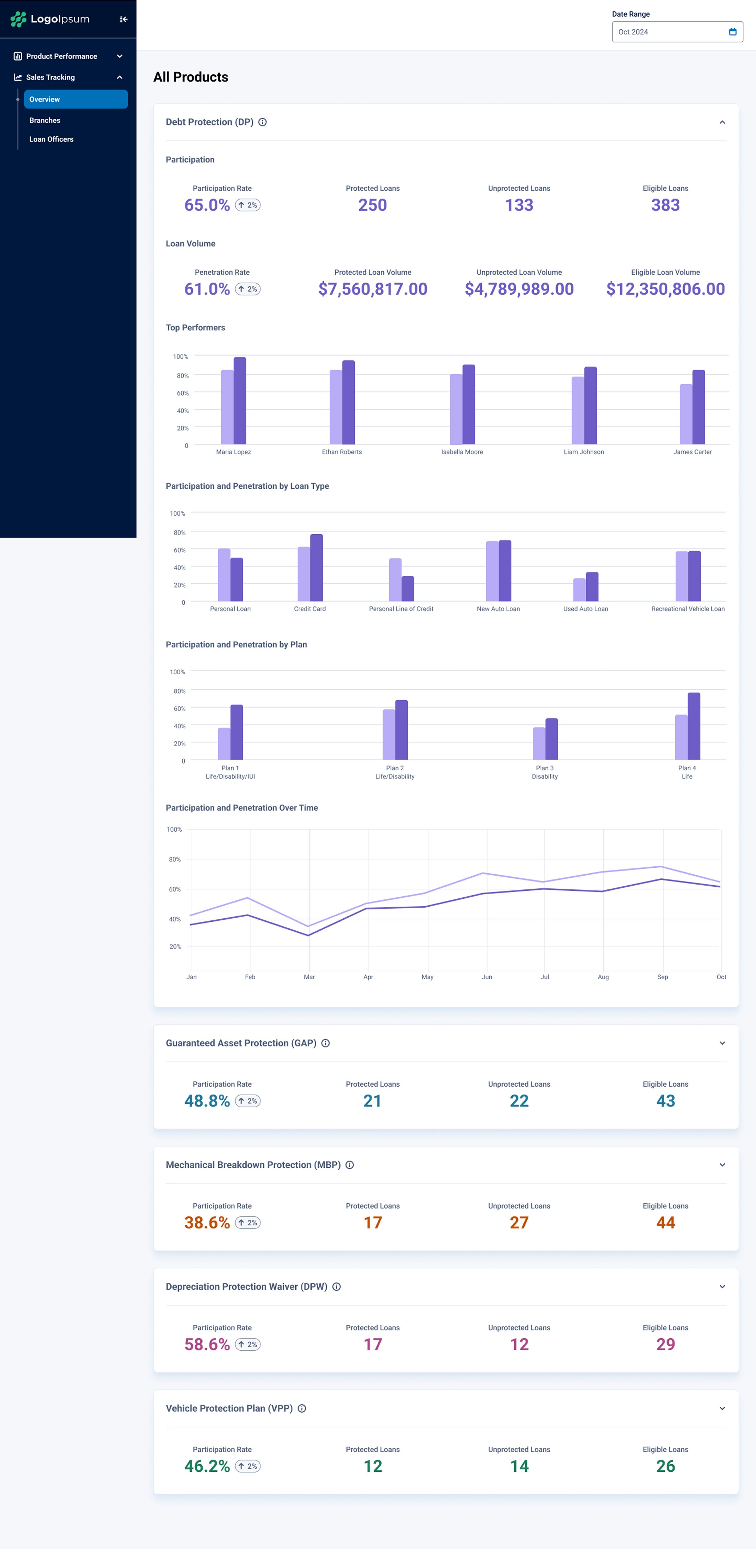
The clients and sales team loved the new information architecture, but there was a consistent pattern of feedback that they missed the donut charts in earlier versions. The visual elements made it easier to get information at a glance. They also liked the idea of color coding the chips showing trend information as positive or negative to further the ease of scanning the data. Design reviews led to some minor restructuring of the placement of global elements, as well, to ensure consistency across our suite of products.